-
"A bit like Doctor Who’s different incarnations, while still the same company, the spaces we’ve worked in have created very different feeling BERGs.
And, a bit like Doctor Who, I guess you have one incarnation that you always think is the best, or ‘yours’." All of this.
-
"She is omnipotent. She can conjure up an army of parkour chimney sweep ninjas! But she also has to come and go with the weather, and where there is technology, if you like, it does not always do what it should. It plays up. The umbrella handle is a bit shitty with her. The toys don't always clean themselves up at her command." I always like Schulze on Mary Poppins, and whilst it's quotable, it's probably not the most representative quote of this marvellous article. The main reason I use it is this article, more than many I've read, explains what being in a room with Jack at work is like. It's also lovely to see all the threads, some of which I saw beginning, come together. Good photos, too, of what work looks like.
-
Charming. My favourite thing about this is that it's a picture of home, and, weirdly, it arouses the same emotions in me as it would if it were a poster of a real place.
-
"Looking at the Little Printer, I feel a little bit like I do about the cats and Ada's toys – I want to pick it up and give it a cuddle. I do not feel that way about our Samsung MNL-2855ND laser printer in the office. A different thing, in a different place, used differently. I hope BERG will do a Little Eye sibling."
-
"It feels like a blip to be in this world full of squares of glowing glass, and it doesn't seem plausible that we'll have that forever." Yes, that.
Last weekend, BERG invited a selection of friends to participate in their first Little Printer hackday. Over the course of a short Saturday, we were asked to explore the API for making “publications” for Little Printer, and test them out on sample devices.
I had a few ideas, but decided for expediency to return to my “Hello World” of connected things: Tower Bridge.
My publication would be something you could schedule at pretty much any time, on any day, and get a list of bridge lifts in the next 24 hours (if there were any).
I could have made this a very small, simple paragraph, to fit into a busy list of publications. Instead, I decided to explore the capacities of the Little Printer delivery as a medium.
I was interested in the visual capacity of the Printer: what could I communicate on a 2-inch wide strip of paper? All of BERG’s publications to date have been very beautiful, and the visual design of publications feels important – it’s one of the many things that distinguishes Little Printer, and I wanted to try to aspire to it at the very least.
So I built an Observer’s Guide to Tower Bridge, based on a chlidhood of Observer’s Guides and I-Spy books. As well as listing lifts for the next 24 hours, I’d show users pictures of the boat that would be going through, so they could identify it.
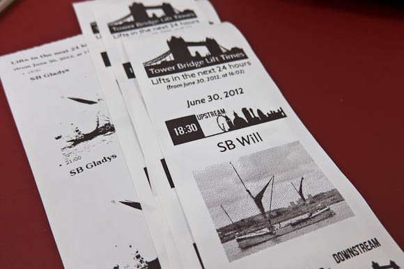
I also visually communicated which direction upstream and downstream are. I don’t think it’s immediately obvious to most people, and so the “downstream” icon shows that it’s towards Tower Bridge, whilst the offset of the “upstream” icon illustrates that it’s towards Big Ben and the Millennium Wheel. It felt like a natural way to make this clear visually, and was economical in the vertical dimension (which is one of Little Printer’s bigger constraints).
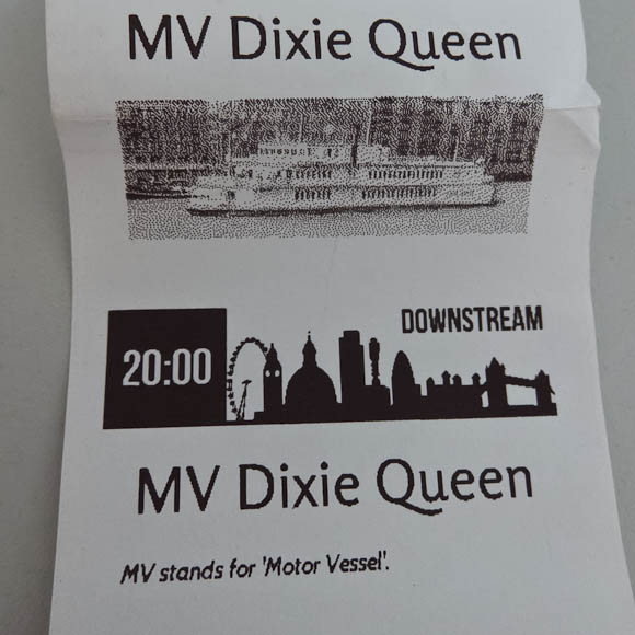
Early versions showed a photo for every lift, which turned out to make the publication too big: I needed to shrink that vertical axis. I did this by only including photos of an individual boat once per delivery – you don’t need multiple pictures of the same boat. The second time a boat passed through the bridge, I instead displayed a useful fact about it (if I knew one) – and otherwise, just the lift time.
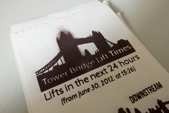
By making the publication shorter, I also avoided an interesting side-effect of running the printhead too hard. The grey smudging you see above is where the printhead is running very hot having printed eight inches of bridge lifts and photos (it prints bottom-to-top, so the text is the “right way up”). Because I’d printed so much black up top, it seemed like the head had a bit of residual heat left that turns the paper grey. This is a side-effect of how thermal printers work. You don’t get this if you don’t go crazy with full-black in a long publication (and, indeed, none of the sample publications have any of these issues owing to their careful design) – a constraint I discovered through making.
The Observer’s Guide was an interesting experiment, but it made me appreciate the BERG in-house publications even more: they’re short and punchy, making a morning delivery of several things – bridge lifts, calendar details, Foursquare notes, a quote of the day – packed with information in a relatively short space.
I was pleased with my publication as an exploration of the platform. It’s not open-source because the LP API is very much work in progress, but rest assured, this was very much a live demo of real working code on a server I control. If I were making a functional tool, to be included with several publications, I’d definitely make something a lot shorter.
It was lovely to see Little Printer in the world and working away. It was also great to see so many other exciting publications, cranked out between 11am and 4:30pm. I think my favourite hack might have been Ben and Devin’s Paper Pets, but really, they were all charming.
Lots of fun then, and interesting to design against the physical constraint of a roll of thermal paper and a hot printhead.
-
"I'm super happy with the resulting portrait of where the studio is now: 13 people, working in a garden in the middle of a vibrant city, a strong ethic, and maps and visualizations in active use by the public." A lovely description – it's a brilliant office to be in. Also, they totally have a piano. And: how lovely to see the maps laid out: seeing this issue, it reminds me just how beautiful many of them are, and how well they stand the test of time – Cabspotting, for instance, is increasingly iconic.
-
"What was quite nice is seeing the piles of paper at the end of the day. It’s very visible that Work Has Been Done Here. The sawdust, as Bridle points out, that’s missing from software development. You get to see the failed experiments and the changing versions printed throughout the day which would normally be hidden away in git." It was a fun day, and this is a nice thought from Dan. I kept all my sawdust, which I'll be writing about when I get a minute.
-
"I’m not sure if this is professional or not. It’s very self motivated and ruthlessly lazy, but also requires experience in knowing what will be a pain later down the line." James sounds like he's being entirely professional to me; this is a good post about maintaining services in your spare time, amongst other things.
-
"Here there are feedback mechanisms that produce more affect and pleasure – for instance the feedback involved in tuning a musical instrument, sound system or a radio. Gardening also seems to be a rich area for examination – where there is frequent work, but the sensual and systemic rewards are tangible." Beautiful work, as ever: I really liked the rewards-for-effort they point out.
-
Gorgeous: light-painting in space with the Visible Human, its slices reassembled into new shapes.
-
"…one point I wanted to make, to all those agencies that have decided that making products is the future. That's a laudable and intelligent aim, but it took five years for BERG to go from here to here. And they're really good. They had to be focused and ambitious, working really hard. This isn't stuff you can just chuck out the back of a creative technology department Just a thought." Yeah, there is that.
-
"Little Printer lives in your home, bringing you news, puzzles and gossip from friends. Use your smartphone to set up subscriptions and Little Printer will gather them together to create a timely, beautiful mini-newspaper." Little Printer sees the light of day. So, so excited to finally see it in the world; can't wait to see it in other homes. (And: beautiful work on the design – industrial, brand, web, the whole package).
-
"We are making a model of how a product is, to the degree that we can in video. We subject it to as much rigour as we can in terms of the material and technological capabilities we think can be built.
It must not be magic, or else it won’t feel real.
I guess I’m saying sufficiently-advanced technology should be distinguishable from magic." This is a lovely pulling-together of things from Matt J, and really manages to express the notions of "physics" and "rulesets" that I always enjoyed so much.
-
"Unlike the iPhone and Android apps, which are built on feeds from the website, this one actually recycles the already-formatted newspaper pages. A script analyses the InDesign files from the printed paper and uses various parameters (page number, physical area and position that a story occupies, headline size, image size etc) to assign a value to the story. The content is then automatically rebuilt according to those values in a new InDesign template for the app.
It’s not quite the “Robot Mark Porter” that Schulze and Jones imagined in the workshops, but it’s as close as we’re likely to see in my lifetime. Of course robots do not make good subs or designers, so at this stage some humans intervene to refine, improve and add character, particularly to the article pages. Then the InDesign data goes into a digital sausage machine to emerge at the other end as HTML." Niiiiice.