Last weekend, BERG invited a selection of friends to participate in their first Little Printer hackday. Over the course of a short Saturday, we were asked to explore the API for making “publications” for Little Printer, and test them out on sample devices.
I had a few ideas, but decided for expediency to return to my “Hello World” of connected things: Tower Bridge.
My publication would be something you could schedule at pretty much any time, on any day, and get a list of bridge lifts in the next 24 hours (if there were any).
I could have made this a very small, simple paragraph, to fit into a busy list of publications. Instead, I decided to explore the capacities of the Little Printer delivery as a medium.
I was interested in the visual capacity of the Printer: what could I communicate on a 2-inch wide strip of paper? All of BERG’s publications to date have been very beautiful, and the visual design of publications feels important – it’s one of the many things that distinguishes Little Printer, and I wanted to try to aspire to it at the very least.
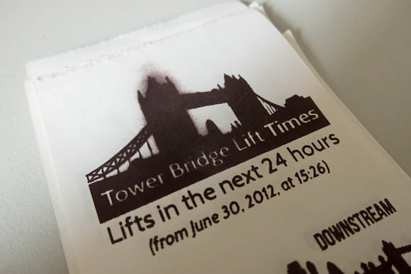
So I built an Observer’s Guide to Tower Bridge, based on a chlidhood of Observer’s Guides and I-Spy books. As well as listing lifts for the next 24 hours, I’d show users pictures of the boat that would be going through, so they could identify it.
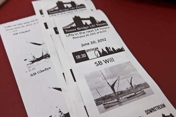
I also visually communicated which direction upstream and downstream are. I don’t think it’s immediately obvious to most people, and so the “downstream” icon shows that it’s towards Tower Bridge, whilst the offset of the “upstream” icon illustrates that it’s towards Big Ben and the Millennium Wheel. It felt like a natural way to make this clear visually, and was economical in the vertical dimension (which is one of Little Printer’s bigger constraints).
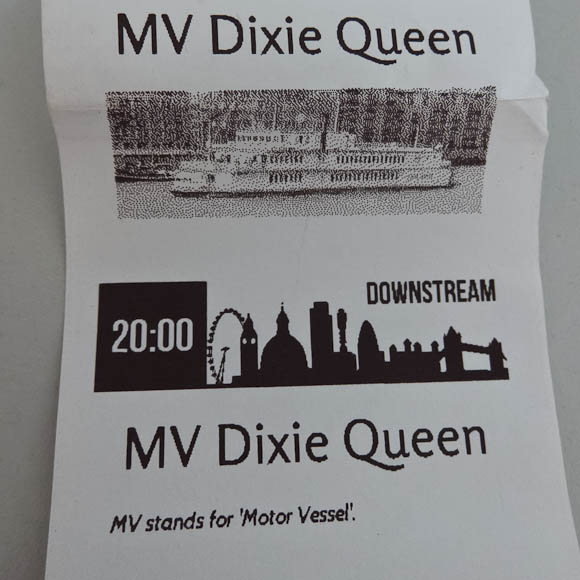
Early versions showed a photo for every lift, which turned out to make the publication too big: I needed to shrink that vertical axis. I did this by only including photos of an individual boat once per delivery – you don’t need multiple pictures of the same boat. The second time a boat passed through the bridge, I instead displayed a useful fact about it (if I knew one) – and otherwise, just the lift time.
By making the publication shorter, I also avoided an interesting side-effect of running the printhead too hard. The grey smudging you see above is where the printhead is running very hot having printed eight inches of bridge lifts and photos (it prints bottom-to-top, so the text is the “right way up”). Because I’d printed so much black up top, it seemed like the head had a bit of residual heat left that turns the paper grey. This is a side-effect of how thermal printers work. You don’t get this if you don’t go crazy with full-black in a long publication (and, indeed, none of the sample publications have any of these issues owing to their careful design) – a constraint I discovered through making.
The Observer’s Guide was an interesting experiment, but it made me appreciate the BERG in-house publications even more: they’re short and punchy, making a morning delivery of several things – bridge lifts, calendar details, Foursquare notes, a quote of the day – packed with information in a relatively short space.
I was pleased with my publication as an exploration of the platform. It’s not open-source because the LP API is very much work in progress, but rest assured, this was very much a live demo of real working code on a server I control. If I were making a functional tool, to be included with several publications, I’d definitely make something a lot shorter.
It was lovely to see Little Printer in the world and working away. It was also great to see so many other exciting publications, cranked out between 11am and 4:30pm. I think my favourite hack might have been Ben and Devin’s Paper Pets, but really, they were all charming.
Lots of fun then, and interesting to design against the physical constraint of a roll of thermal paper and a hot printhead.