-
"You wouldn’t think you could get homesick for a simple button. You’d be wrong."
Train toilets: not such a design nightmare any more.
23 December 2006
Around a year or more ago, I had an interview for a job (which I was offered, and which for various reasons I had to turn down). There were two great questions in it:
“Give me an example of design you love,” and “Give me an example of design you hate“.
The first was tricky. I needed something I not only loved but that I could explain why loved it (and not sound too cliché at the same time). In the end, I went with the Nintendo Wavebird, for its use of technology (the wireless), texture and shape (both of which vary across all buttons).
It was much easier to find something I hated, though. I’ve always hated – with a real passion – the automatic loos on trains, such as those on Virgin. They drive me absolutely mad.
They have three buttons inside: open, close and lock. When you step inside one, the “close” button flashes, indicating you should press it. Fine. Once you press it, the door shuts, and the “lock” button flashes, indicating you should lock it. Again, fine; you push lock and hear a clunk. What frustrates me is that then the open button flashes and so, obviously, you push it, and the door wanders open, leaving you frantically hammering “close” to stop looking like a wally who can’t work the doors. It’s not just me, either; I’ve seen lots of people do it!
I was asked how I could improve this design.
I think the problem comes in the use of three buttons. Open and close as two seperate buttons I can take, but lock isn’t really a button – it’s a toggle; you need to be able to see both locked and unlocked states. So I suggested keeping two buttons for open and close, and implementing a lever for locked/unlocked. Ideally, the lever should be horizontal, to indicate the locking motion, and to distinguish itself from the two vertical buttons.
It’s a design problem I run into quite a lot, usually on the web, where a collection of radio buttons are used not to switch between several states of one condition, but to represent several unrelated ideas.
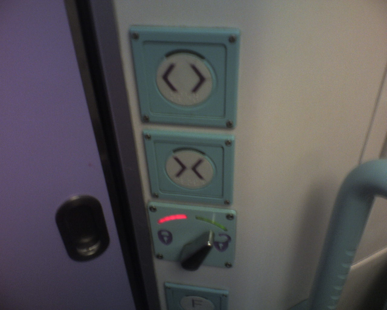 So imagine my surprise when, on the train home this morning, I found that the First Great Western toilets have been substantially modified (see left). At the top, open and close – and then a flick left/right switch for locking, with a red light for ‘lock’ and green for ‘unlocked’.
Much better. I didn’t make a mistake, and was confident that the door was locked (or unlocked) thanks to the visual indication of a lever. It makes me wonder if someone from FGW was sitting in on that job interview…